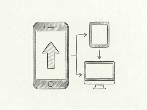
Mobile-First Strategy
We design for the smallest screen first. This forces us to prioritize the most critical content and actions, ensuring the mobile experience is fast, focused, and efficient before scaling up to desktop.
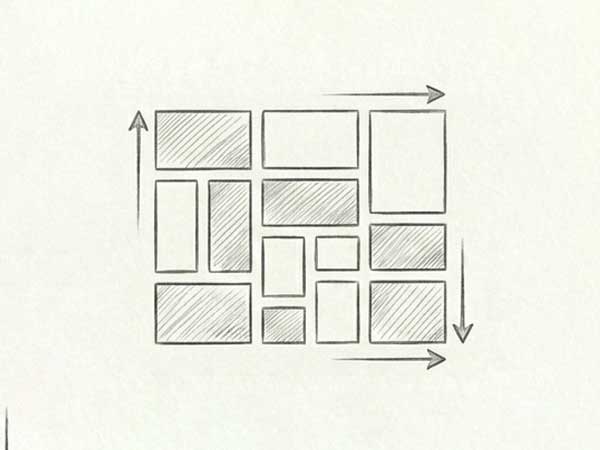
Fluid Grid Layouts
We use fluid grid systems that use percentages rather than fixed pixels. This allows your website's structural elements to resize proportionally, maintaining balance and harmony on any screen width.
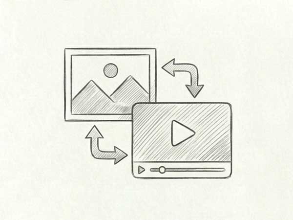
Flexible Media & Images
Images and videos can break a layout if not handled correctly. We implement responsive media techniques that ensure visuals scale down or crop intelligently without losing quality or slowing down load times.
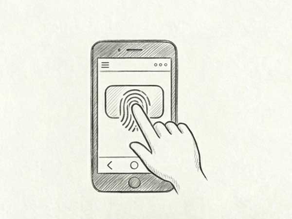
Touch-Friendly Navigation
Mouse cursors are precise; fingers are not. We design navigation menus (like "hamburger" menus), buttons, and form fields that are sized and spaced appropriately for touch interaction.

Breakpoint Optimization
We don't just design for "mobile" and "desktop." We define custom "breakpoints" (specific screen widths) to ensure the layout shifts smoothly for intermediate devices like large tablets and small laptops.

Performance Optimization
Mobile users are often on cellular data networks. We optimize code and assets to ensure your responsive site loads instantly, preventing users from abandoning the page due to lag.